Appster
Wireframing
Branding & Identity
UX/UI Design
During the last six months of my time in Melbourne, I was contracted by Australian app development firm Appster to work on the end-to-end design process for one of their US clients - Neighbor Labor. They were a newly established company, so not only would I be working on the product design, but also on the branding and general styling for the company too.
It was really exciting for me to have virtually full design ownership of the product from the initial wireframes right through to high-fidelity asset delivery for developer handoff. It was a great experience also to fully dive into some of the fundamental differences in iOS and Android, and to embrace the journey from a 'post-it' idea to fully tangible digital product.
Seekers & Providers
The idea behind Neighbor Labor was not a totally revolutionary one, but it was certainly something that drew on first-hand experience from using an on-demand services app. One issue with a lot of competitors is that some 'Providers' can saturate a marketplace by applying for hundreds of jobs with low-ball offers, and then subcontracting out each task and thus undercutting the competition.
Some of the key USPs behind Neighbor Labor are to only allow Service Providers to accept one job at a time (they physically cannot apply for another job until their current one has been marked as complete) and to limit Providers from accepting jobs in far-away ZIP codes. The incorporation of the chat and notification mechanism for each job really aimed to make it feel like two genuine humans were communicating; one neighbour that needed a job doing, and one neighbour that could help out.
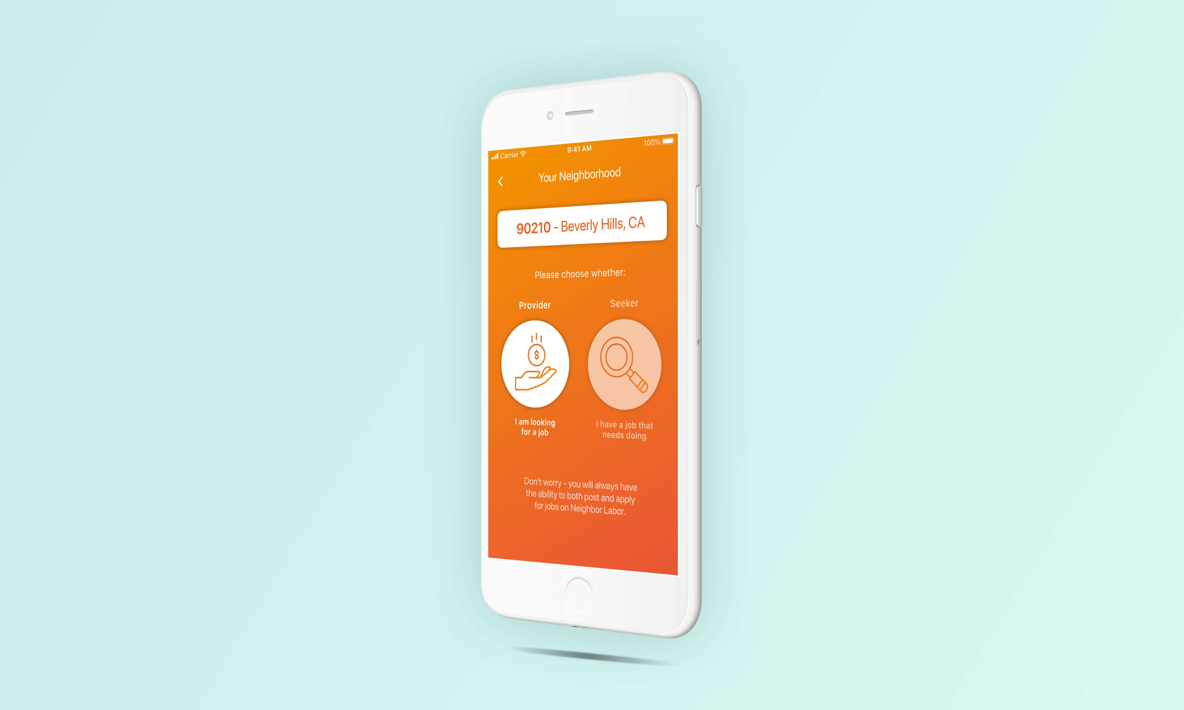
At first, in our user stories there was a clear definition between whether a user was either a Seeker or a Provider. Once we started wire-framing however we quickly realised that this notion contradicted the idea of neighbours helping each other out. There should be no reason that someone who signs up because they want someone to paint their house shouldn't be able to offer their own services of lawn mowing because they happen to have a fancy ride on mower.
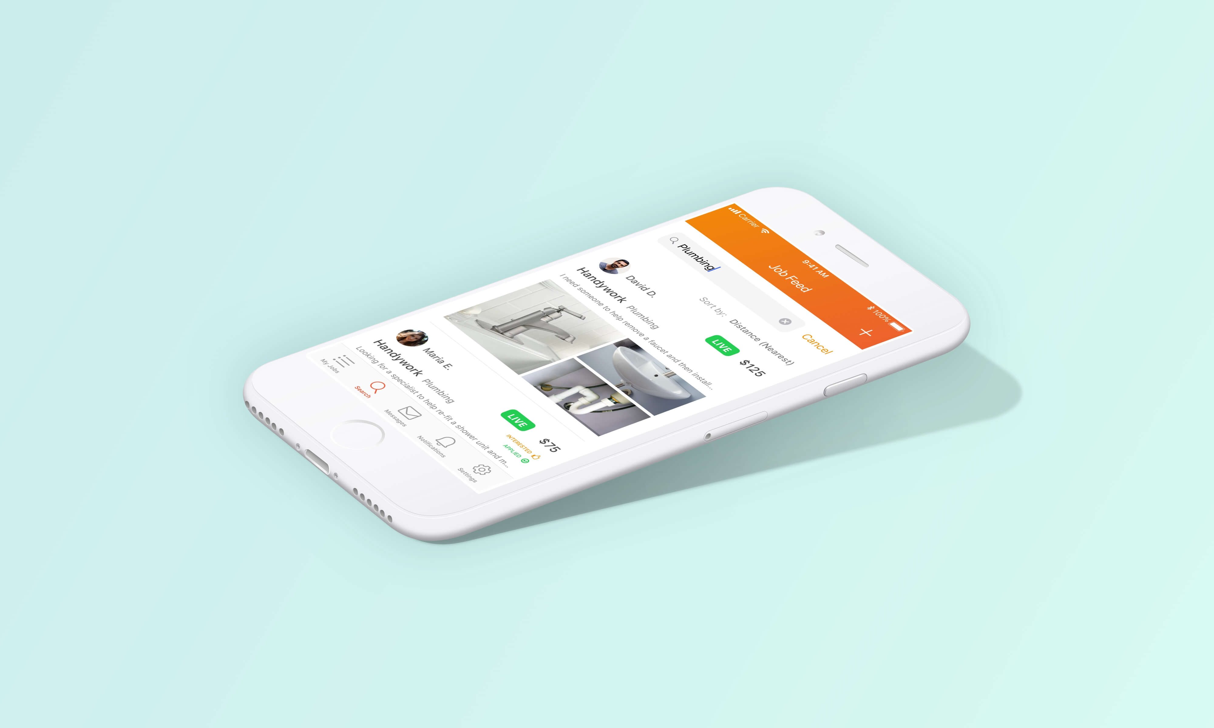
We worked hard to make the user journeys of both posting and applying for a job feel similar, so that you could naturally flow through the product whether you primarily identified as a Seeker or as a Provider. We also wanted to enable a discovery style for Providers, allowing to browser all jobs and sort either by experience, specification or just by their local area.
User Journeys
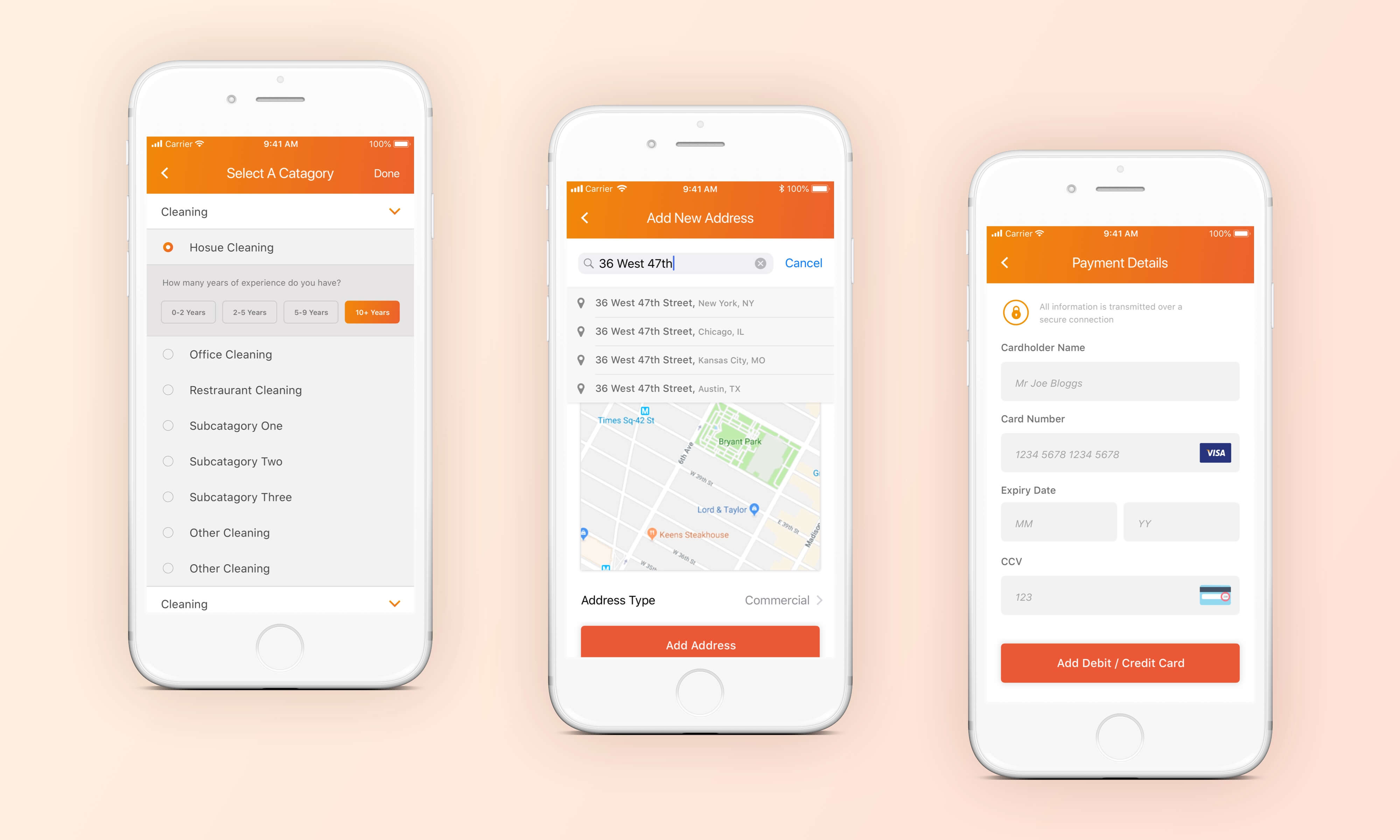
With a product such as Neighbor Labor - the process of onboarding and getting the user really embedded into the app can be a long one - especially if they are creating a profile for themselves as a service provider. I aimed to the keep the design and styling of the app as simple as possible, and so the flow through each page felt natural.
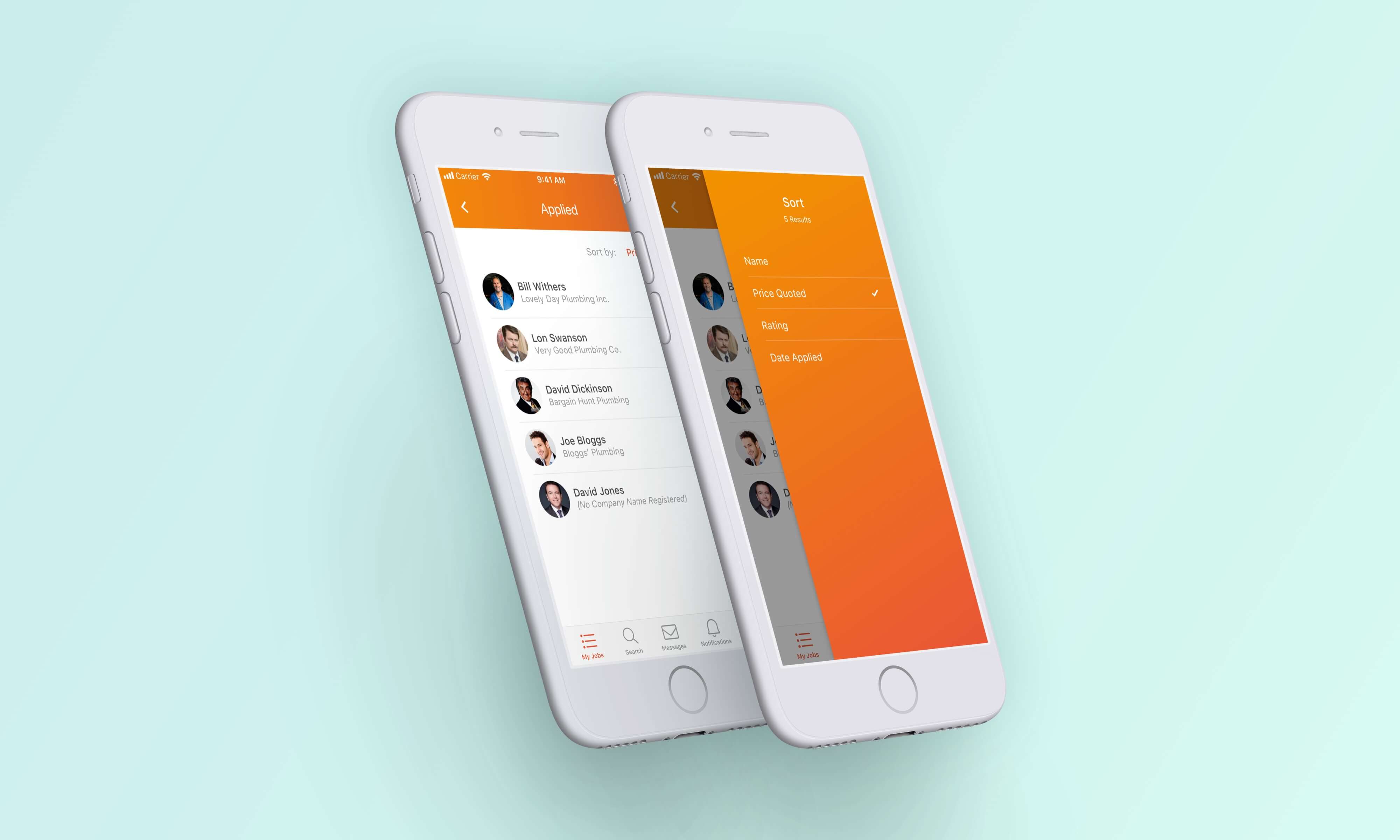
We wanted users to be able sort through any list results easily and quickly, whether that was looking through a list of applying providers, relatable job offerings or any other searchable item. We included the same search and filter mechanisms in different areas of the product to again increase the feelings of familiarity and ease the learning curve of the app.
Feel & Style
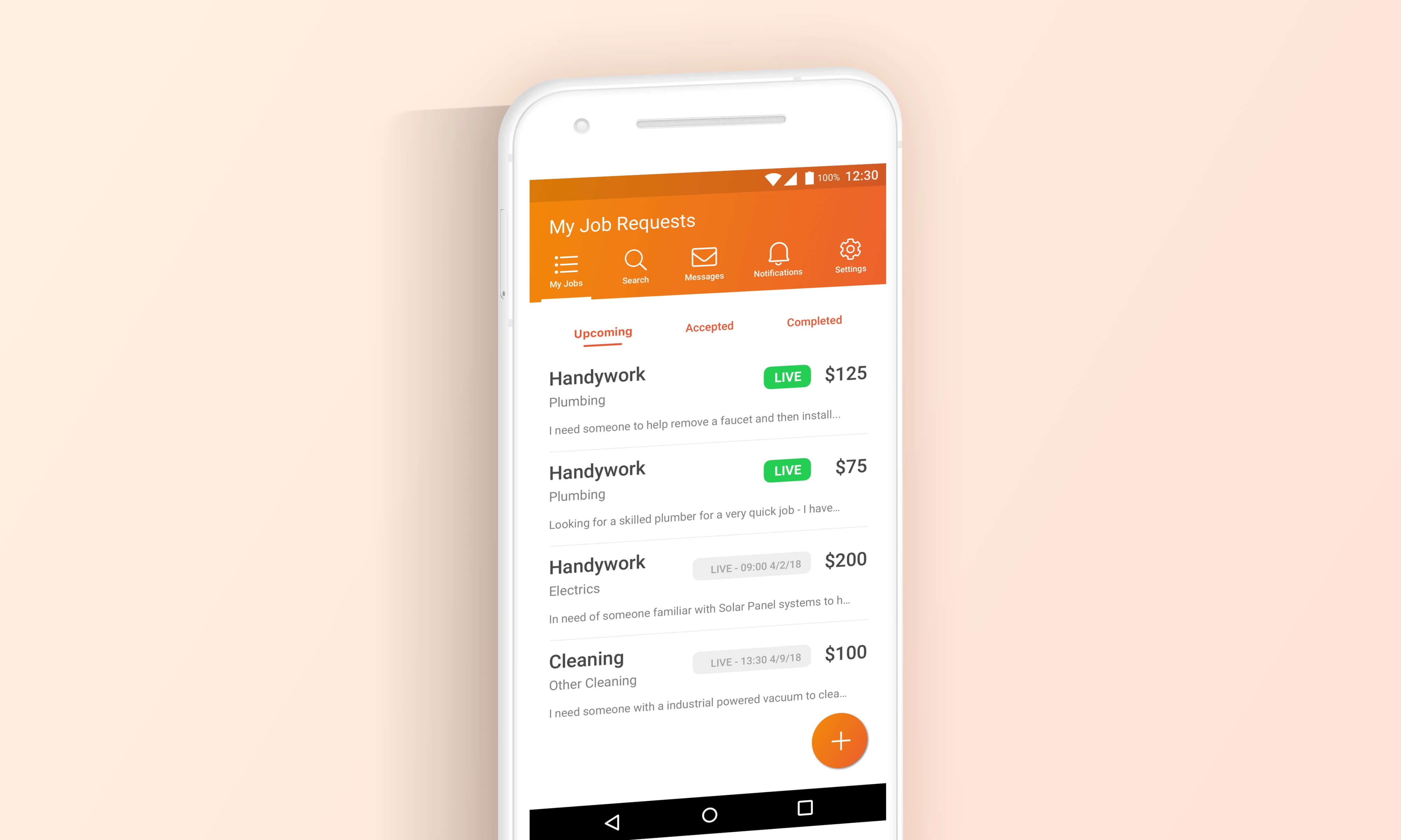
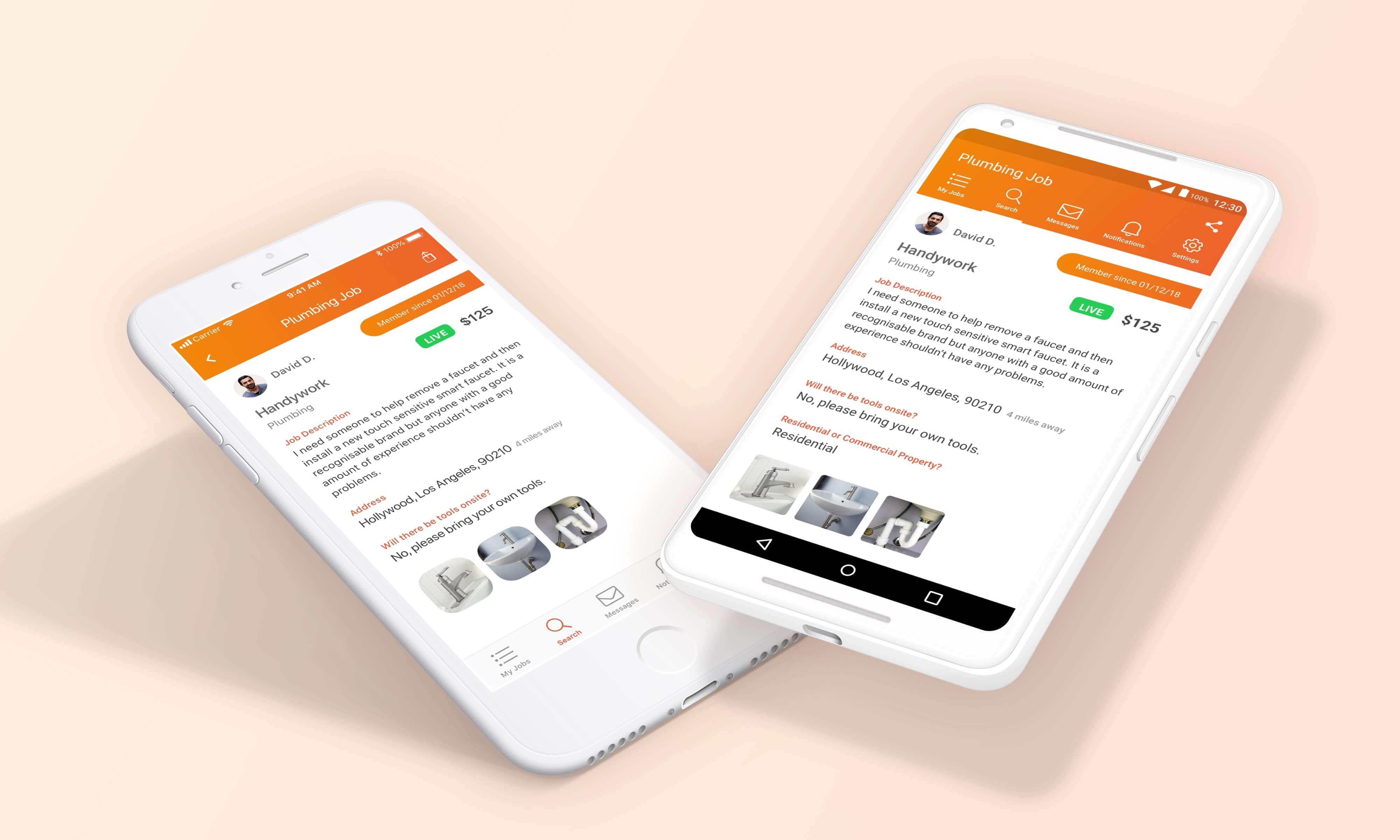
We were keen to keep each version of the product as native as possible, so decisions were made to use respective native iOS and Android elements where possible. In the screen above you can see in the Android version the toolbar at the top of the screen, the use of a floating action button and the native font, Roboto. The colours however were kept identical where possible to solidify the brand image.
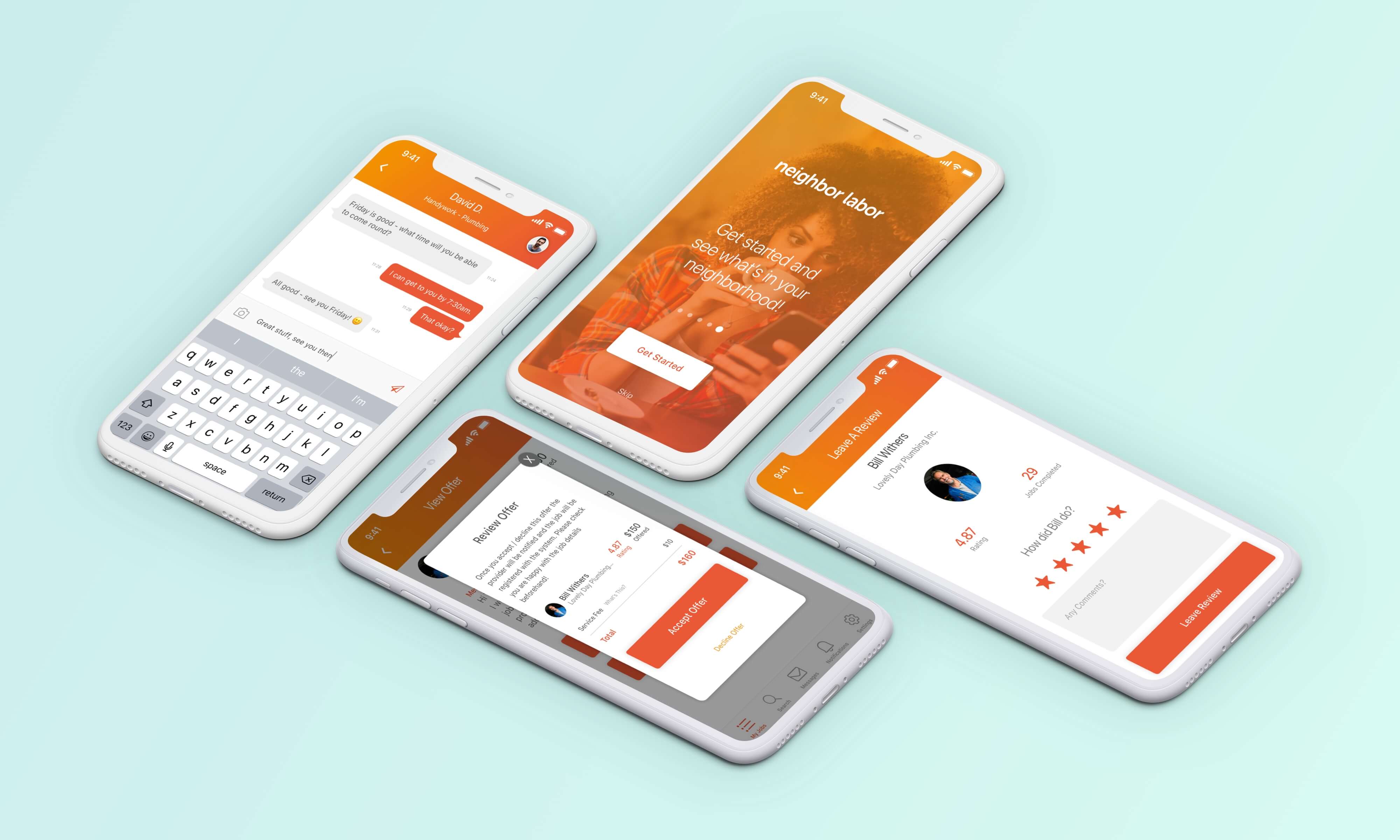
Alternatively in the above screen here you can see some of the iOS screens and how we aimed to bridge the gap between an app that feels native, by use of overlays, chat styles and general layout, but also inject the brand personality with the strong use of colour. Look out for the app coming to a neighbourhood near you soon!