Moneybox
UX/UI Design
iOS & Android
Moneybox is a savings and investment product designed for new and experienced investors alike. They are still a fairly young startup, but fully embracing growth mode and really defining their brand and product in the FinTech space. At the time I was contracted in, Moneybox were increasing their investment fund options from three to seven, meaning their customers were getting an increased level of control over how their money was invested. This also meant there were an increased number of ‘ifs’ and ‘buts’ to consider from a UX perspective…
Onboarding
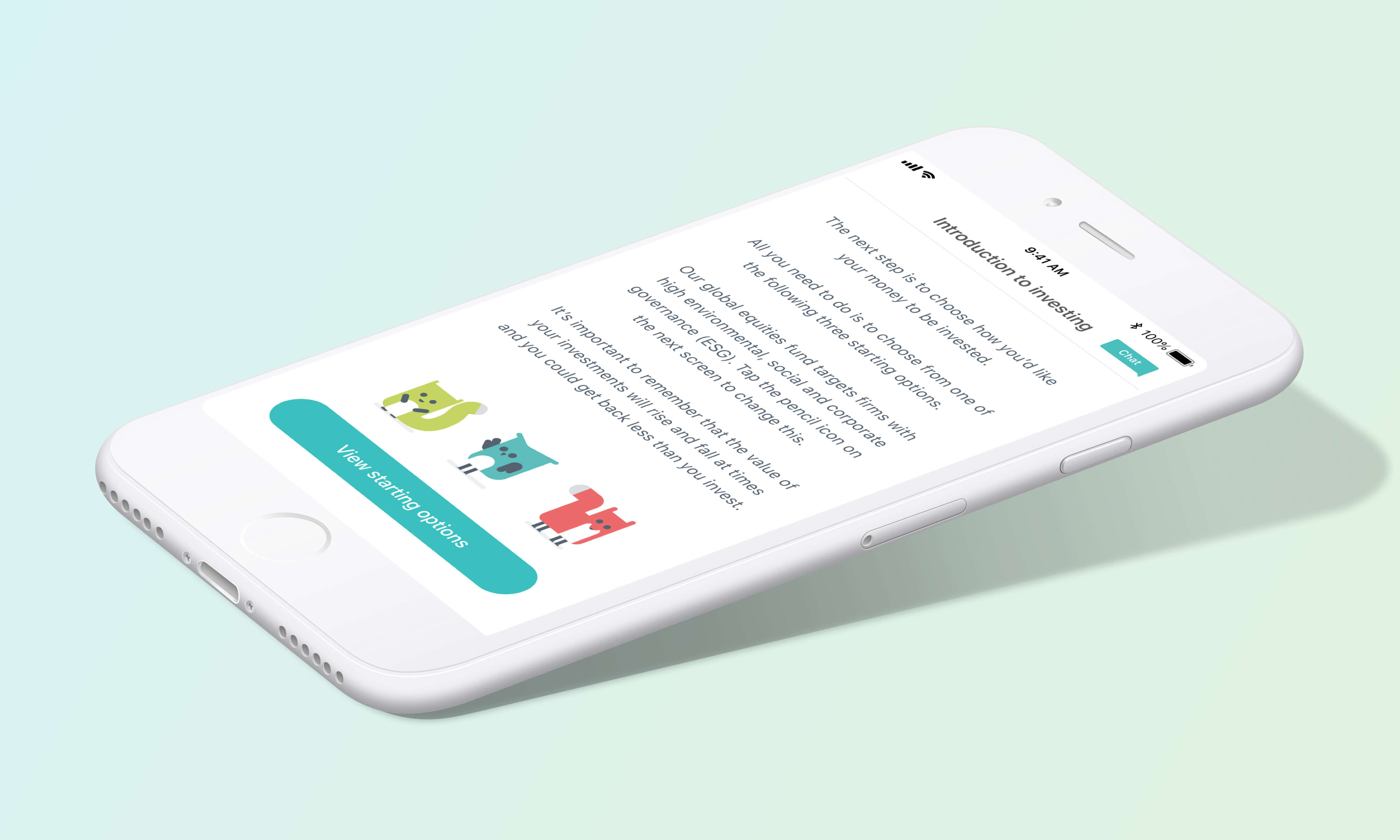
A key feature of the Moneybox product is that it’s quick and easy to sign up, and can be done in a matter of minutes from the palm of your hand. The team were keen to make sure that by adding extra investment funds, the user signup process did not become bloated, but still allowed for customisation by experienced investors who wanted more control over their portfolio.
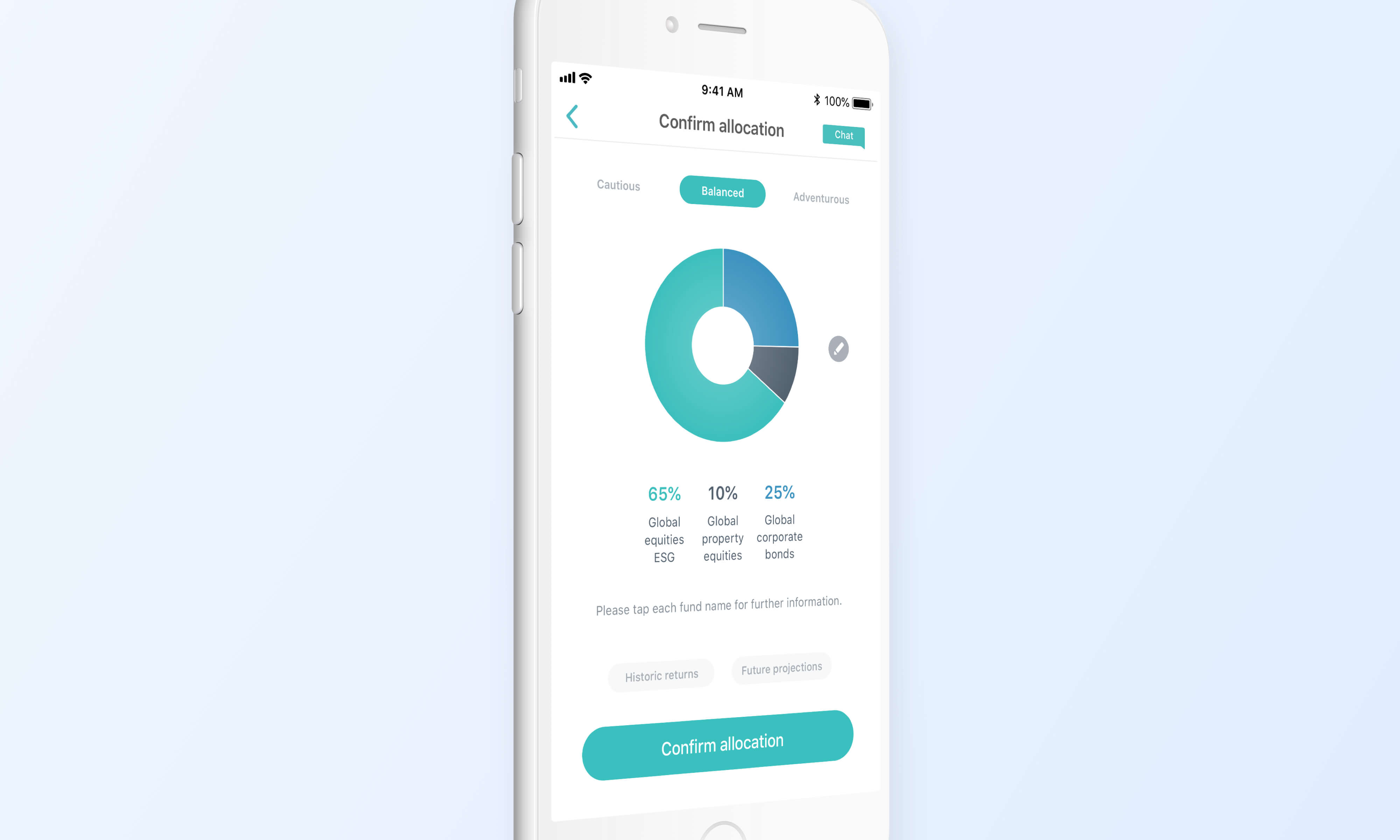
We were keen to keep the donut chart graphic, as user research had shown that it was one of the easiest and quickest to understand charts to display fund allocations to the users. It was important though to be able to fit in the list below with numerical values, as well as the other elements required for regulatory reasons.

Although the style and playfulness of the design on the left was more interactive for the user - the final design on the right was chosen because it ultimately reduced the total number of taps required by the user to complete registration process.
Investments Tab
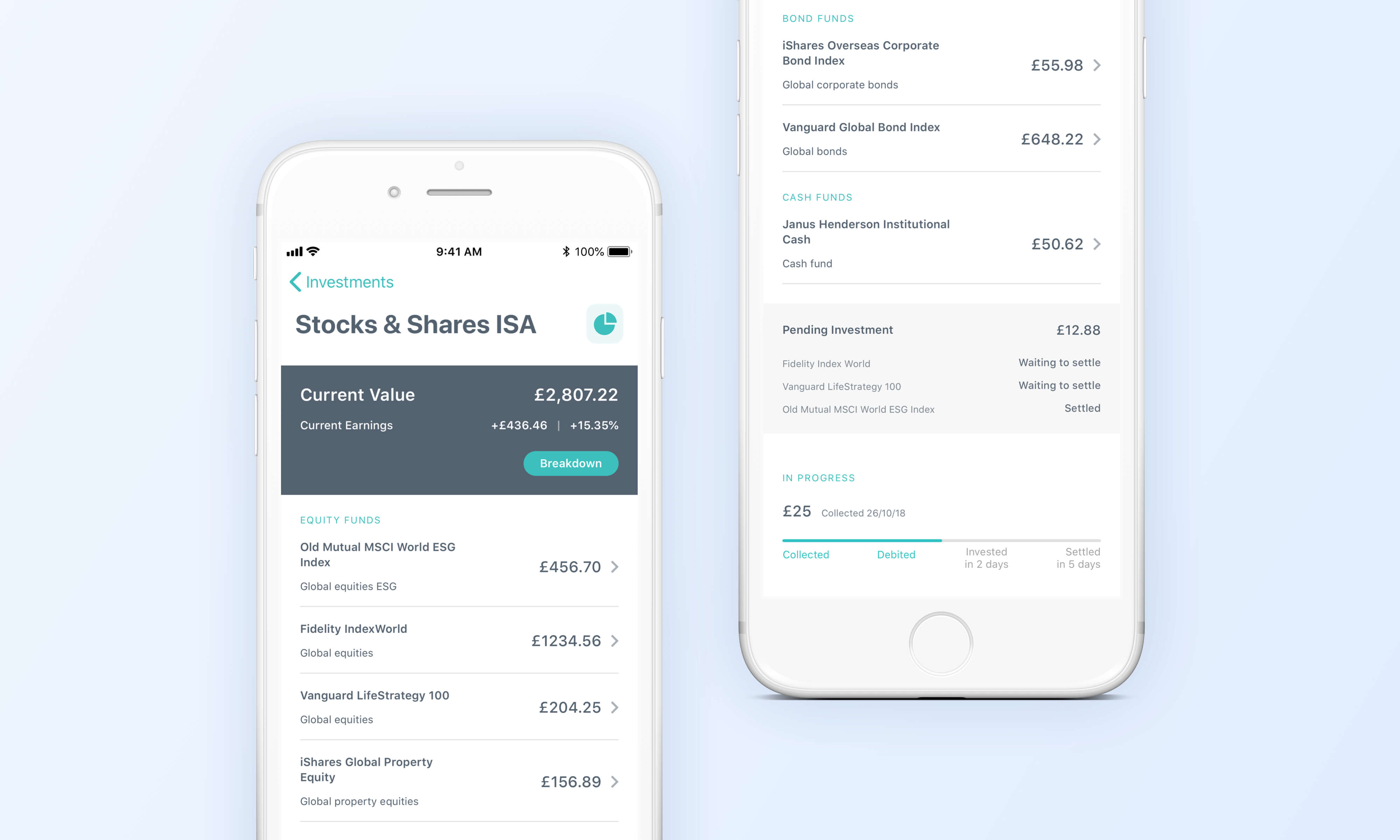
Once customers have used the product for some time, they are able to drill down into their funds performance and see how well it is tracking. With the addition of extra funds available, it became a consideration that some users will have a longer list of funds that extend beyond the fold of their device. It was important therefore to think about the spacing and details of this screen, allowing for funds to be listed clearly and show in their categories and subcategories.
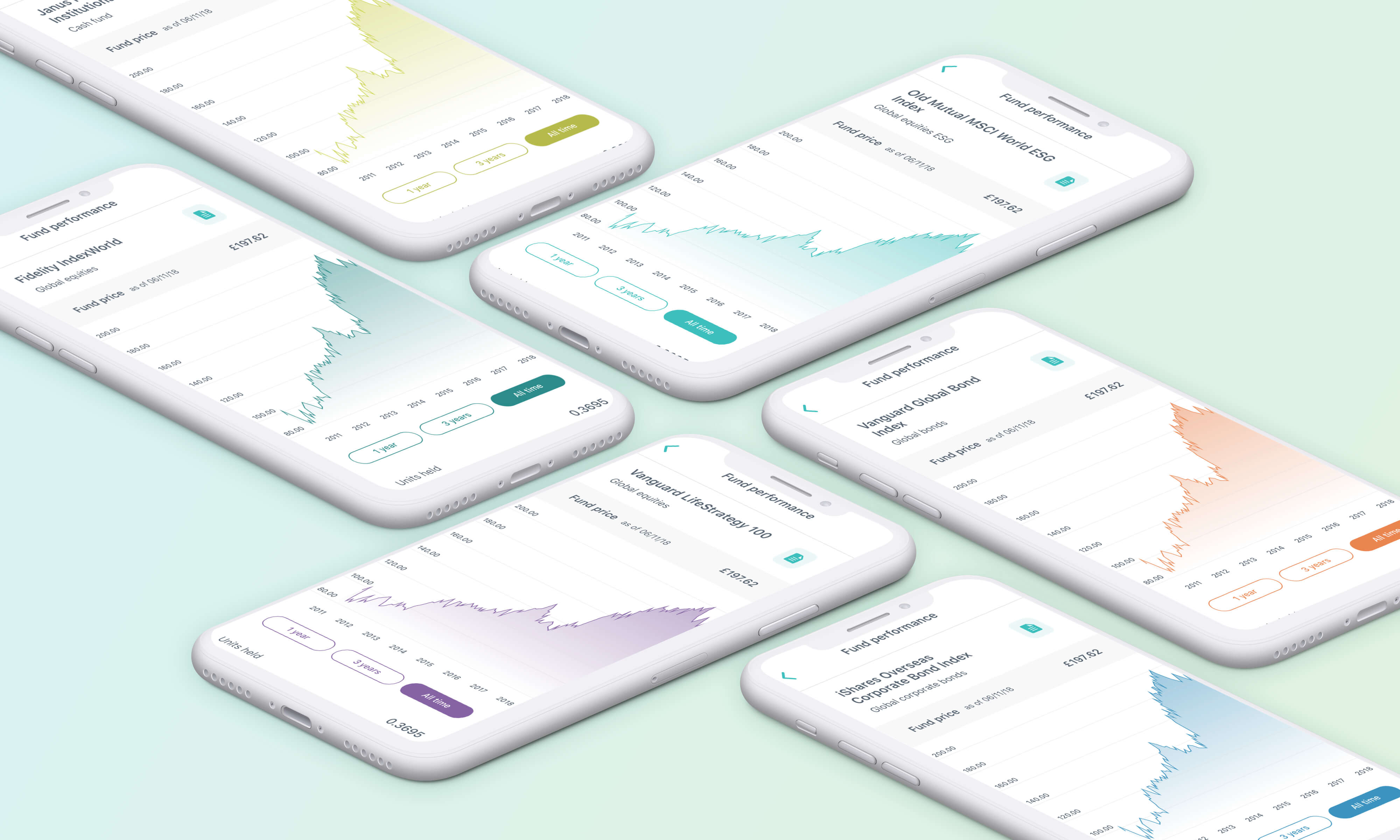
We were keen to implement a reusable colour scheme across each fund, without the product starting to look like a rainbow. A lot of time was spent deliberating shades and hues, and trying to keep away from ‘danger’ colours, something that users won’t like to see when in relation to their hard-earned savings!
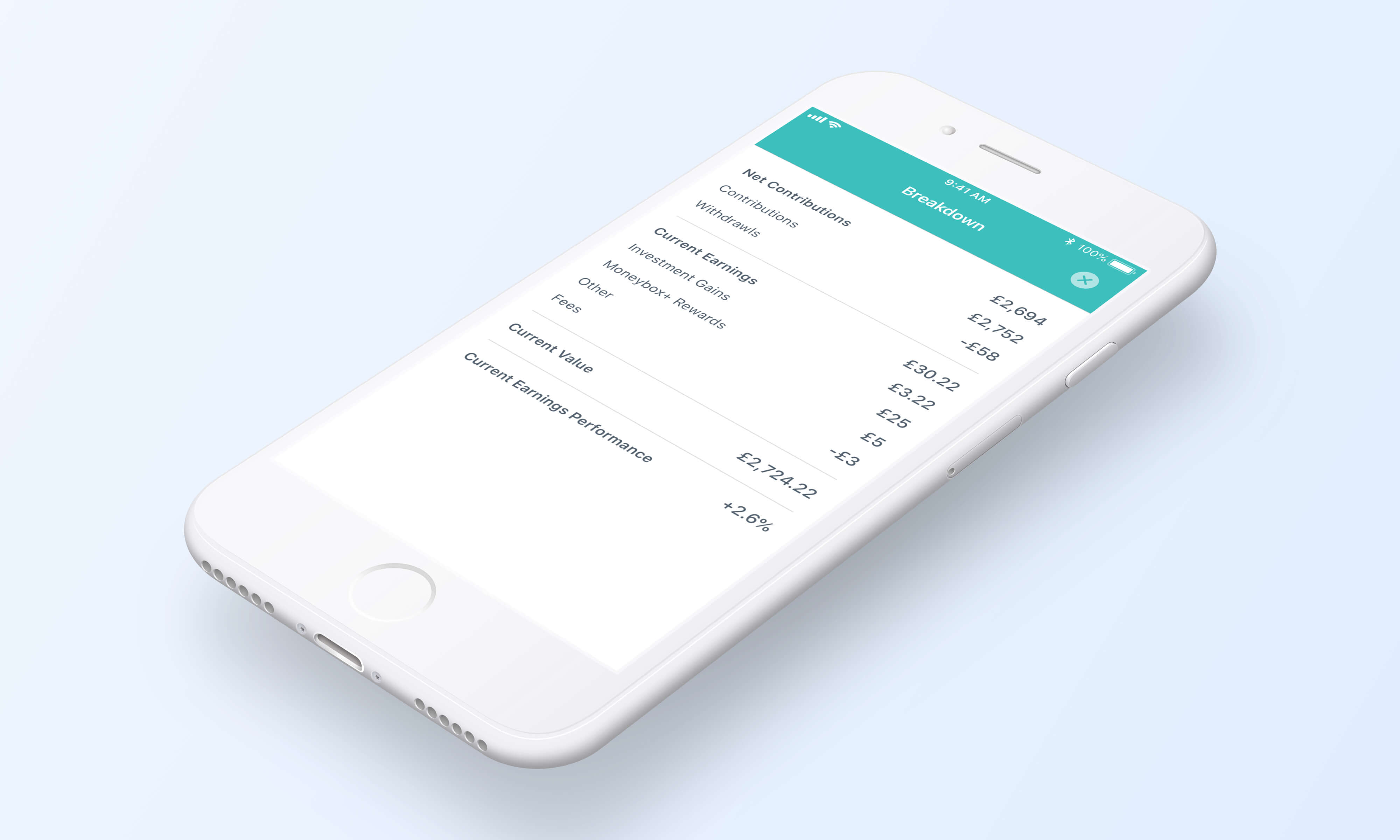
We wanted to provide a clear visual distinction between the breakdown of a users overall portfolio, compared to the breakdown of each particular fund and the elements that were more out of a users control - market performance for example.