Vodafone – eCare
UI Design
Visual Design
Prototyping
Vodafone - one of the UK's biggest mobile networks, has been undergoing a huge agile transformation over the past five years, one of the largest projects I've been involved in being the complete redesign of the eCare Product - essentially the My Account section of the Vodafone website.
It has a huge range of dependancies and covers user scenarios from a sole account user with a single plan, to multi account users with hundreds of subscriptions in SMB and enterprise situations.
As the Lead UI Designer on the project, it has been my responsibility to ensure that the whole application ties in with a new Design System that is being built and implemented at the same time. Working on both features (at the same time) has been in equal parts challenging and rewarding!
Dashboard

The heart of the eCare redesign is the Dashboard, summarising the user's key usage and billing data for them to easily digest. The decision to build a PWA for eCare was made early on in the planning stage, to allow this product to replace the standalone 'My Vodafone App' on iOS and Android, when the product is fully tested and delivered.
We took inspiration from the designs from the current app, and translated them from mobile to desktop, to work on all screen sizes. The wealth of information available to users in eCare is also much broader than in the current app, so we needed to add functionality and find space to house each component.
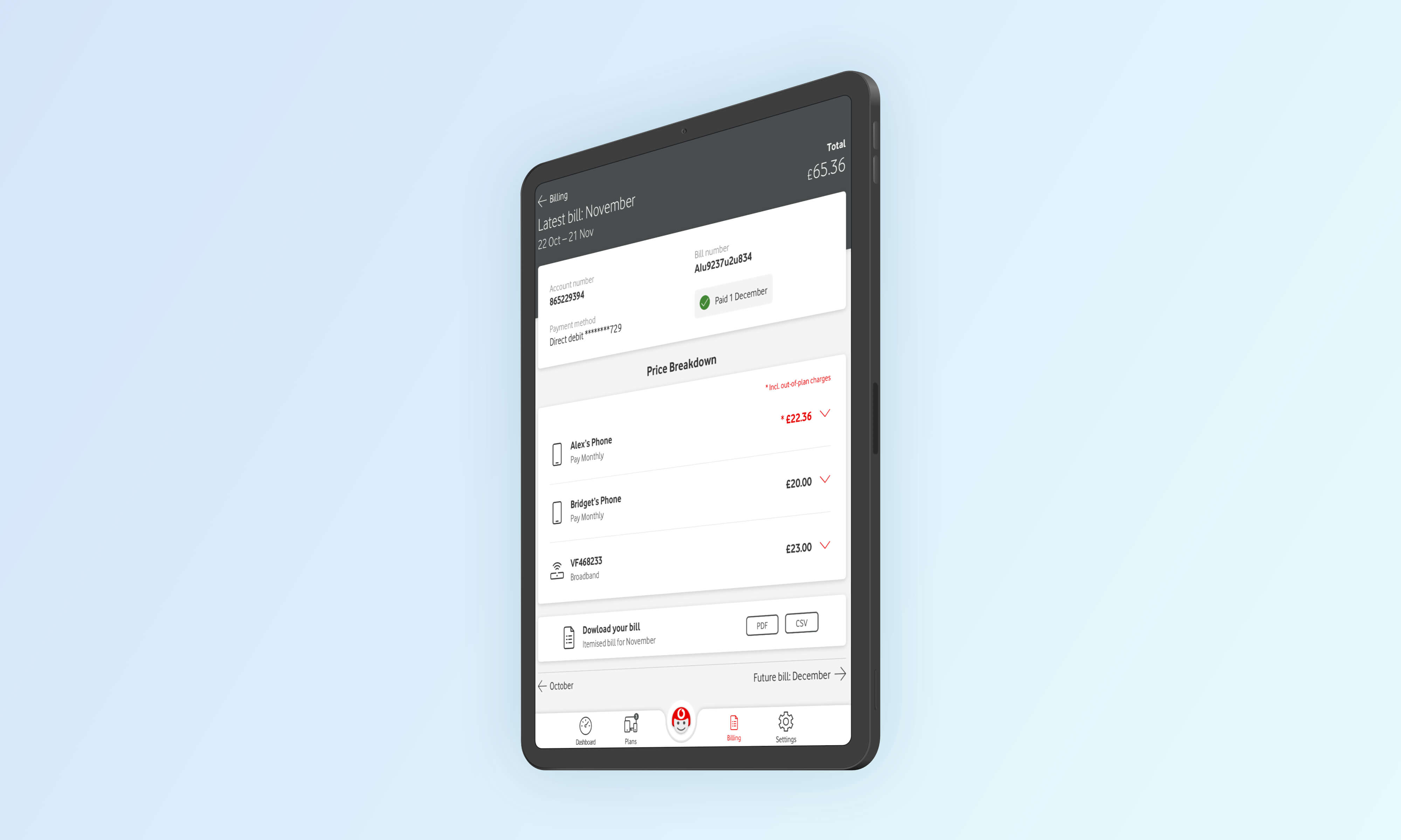
Billing

The Billing section of the app has some of the lengthiest user journeys, and it allows users to drill down into their detailed usage of each particular billing period as well as to manage and amend their direct debit and payment preferences.
The billing graph was one of the more complicated UI elements to design, as there was many user scenarios that we would have to cater for. Often the integrity of a design can be compromised by trying to cater for every possible edge case, but by keeping the visual design simple and the data readable, we achieved some very positive feedback in user testing.
It was important to us that the app had the same level of fluidity whether the user experience was on desktop, tablet or mobile. The sidebar on desktop was echoed by the tray navigation on tablet and mobile, creating a more cohesive user experience.
The TOBi chatbot icon is also always visible to allow users to easily ask questions and get help when they need it. The next generation of TOBi will also act more like a digital assistant, and allow users the option to use simple voice commands like show me my last bill and to display this information quickly and without physical interaction.

We used a mixture of overlays, bottom drawers and expandable sections throughout the billing journey to help users better associate a specific animation style with each level of the of the app.
With thorough user testing, we were able to validate this method as the more users subconsciously recognised the animation and interface pattern, the quicker they were able to navigate around the app from their first instance of using it.
Plans Dashboard

For every mobile or data plan that a user has, there is essentially a sub-dashboard to manage their usage and extras for each individual plan. By using tabs as a top-level navigational tool, but with a differently styled UI, we were able to utilise a pattern that users were already familiar with, but in a different visual context that felt more contained.
We continued to use the card and tile style layout throughout all screens of the app, and to encourage the use of shadows, elevation and playfulness that is making its way back into UI Design in 2020.
Plan Switcher

The Plan Switcher was a great example of an element that had to continually evolve as further requirements were discussed and implemented. The original idea of pagination was scrapped with the scenario of a user having more than 50 plans, and we opted instead for an infinite scroll with lazy loading.
The search filter component was also completely rebuilt to allow results to be displayed as soon as the user has started typing, and to further refine the more they typed. Users were also able to search by information that was not contained on the summary tile, such as addresses, add-ons and extras.