Discovery – Tokyo 2020
At the start of 2021 I undertook a short but fast-paced contract with Discovery UK. The UK team were the base of operations for the EMEA region, working closely with the US Experience team for brand and top-level design advice.
The biggest project they had on the cards was a cross platform design refresh - not a fundamentally different experience but a refresh across all key screens and overhaul of the viewing experience.
The catch was that some of these key screens and experiences needed to be ready for the Tokyo 2020 Olympics, along with the design and capability to support live events and on demand experience all within the native app.
Design System

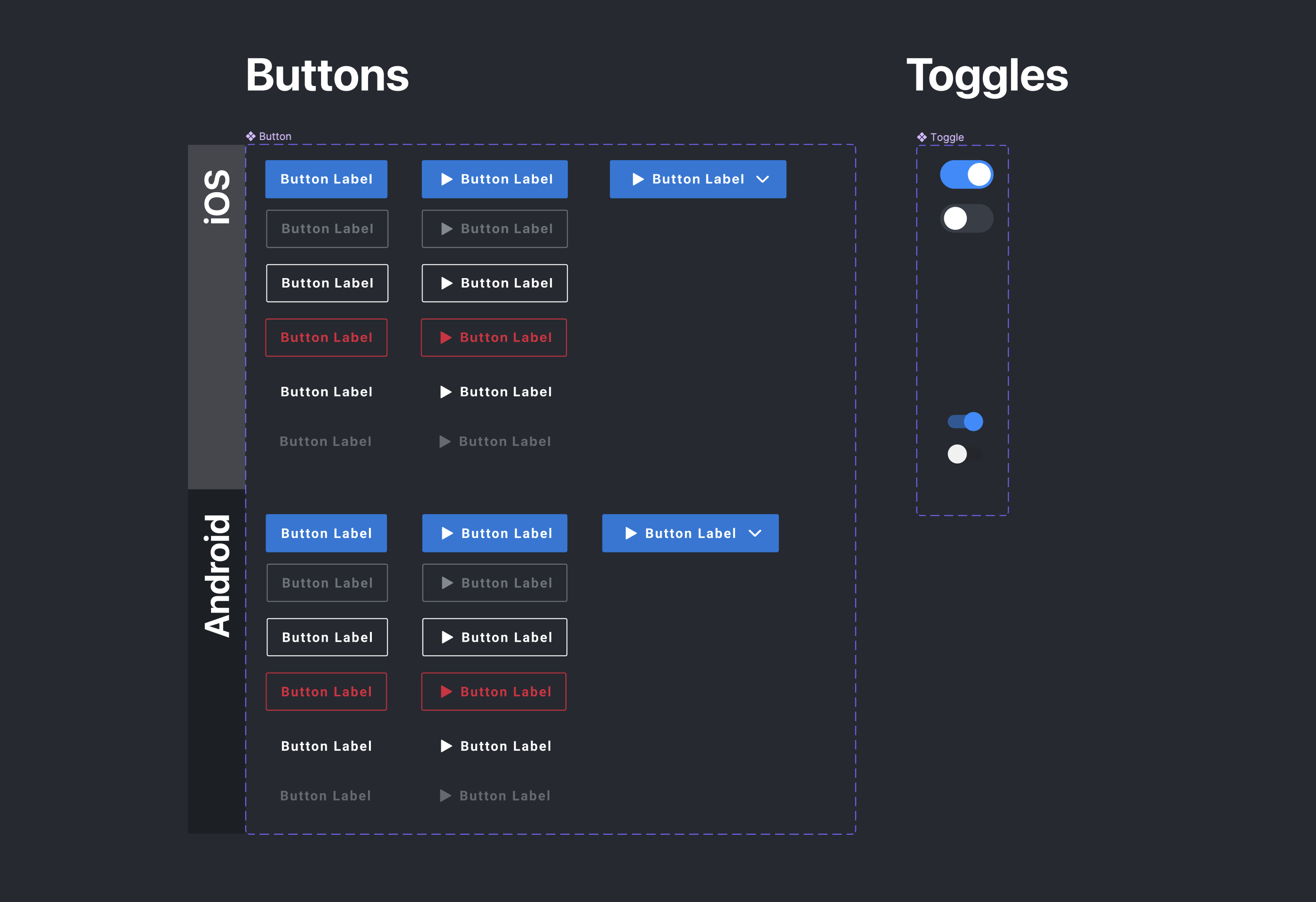
When I started the project, we were fortunate to have an initial Design System and Component Library to work with from the US team - our challenge was to take this conceptual library, and to refactor key pages from the existing designs and work it into a functional experience.
We had the added challenge of adding the functionality to support live events, something that did not exist within the design system already. In particular we had to make sure that the design could support live events for the Tokyo 2020 Olympics - a broadcast exclusive for the EMEA region.
After user testing - our decision was to create a separate tab purely for Olympic content in the main tray navigation bar - as the redesign had altered the navigation structure, and we hoped to reduce the learning curve for existing users experiencing the change.
Tokyo 2020

Tokyo 2020 was a really exciting project to work on - particularly in relation to the sheer number of events to cater for, different sets of data such as medal tables, upcoming events and highlights and everything else in between.
The Olympics content had to sit alongside all the other regular on-demand and live-broadcast content that the app was already showing, and we needed to be aware of users that may be new to the app specifically for the Olympics, as well as regular users who may not have been interested in that content at all.
Live Events

One of the most complex features we had to cater for with Tokyo 2020 was the concurrent live events that would be streamable within the app. There could be more than 20 different sports being streamed live at one single time, so it was essential that the browsing experience didn’t become cluttered, and that we didn’t just push all supplemental on demand and replay content to the bottom of the page.
Research had showed that users tended to act more open and exploratory when it came to watching live sport, but were more decisive when watching on demand. We opted for a dedicated LIVE tab at the top of the page, so that it was equally easy to find or dismiss the live content.
These designs also served as the basis for some of the forthcoming events that Discovery also had the rights to, such as the Allsvenskan football league and the Tour De France.
Video Playback

The most fundamental change coming with the new designs was to the video player within the app. Some of the new features included native casting and subtitle controls, playback speed levels and much improved scrubbing and forward/rewind actions.
Whilst some of the UI and visual design for this feature was more straightforward, we spent a lot of time testing and working though issues with the engineering team. It was also really important that the video experience was consistent across all platforms, so there plenty of opportunity to collaborate with some of the other platform teams.


