Vodafone – Design System
Design Systems
Component Libraries
Atomic Design
A really enjoyable project at Vodafone was to work on the second iteration of their Design System and Component Library - sitting in a dedicated squad of Developers and Designers, purely focused on creating a versatile set of components that could be easily integrated into other teams, without compromising any existing designs or live pages.
As there was already an existing Design System and Component Library in place, our main objective was to define for each component where improvements could be made, agree on the necessary functionality limits and UX guidance, and where required create new components to be added to the library.
One slight complication with this project was that another team needed to implement components from the new library virtually as soon as they had been released for general use - although it created some obstacles it was certainly a good way to test the water in real time!
Components
From a Design perspective - everything we worked on and produced in this Design System existed in Sketch. The trappings of a large corporation meant that switching to Figma wasn't a straightforward option, and as the current v1 library already existed across a selection of Sketch files it seemed the most logical choice rather than waiting for a budget and tooling review!
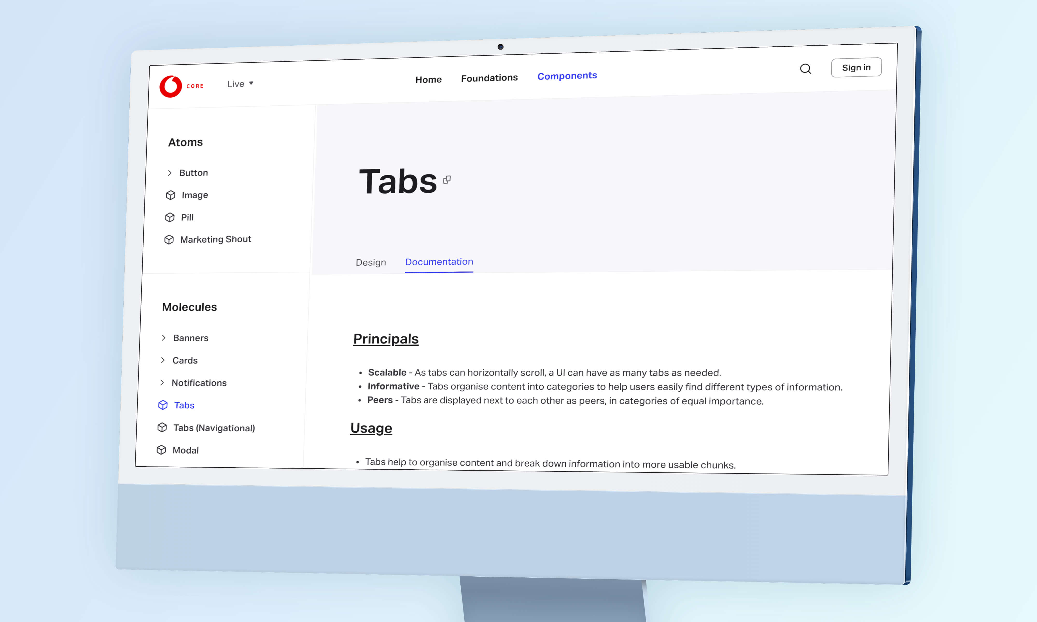
Interestingly, whilst the Developers opted to follow Atomic Structure guidelines for their components, our research indicated that Designers preferred the option to browse components alphabetically or by category. This became an important foundation moving forwards as it resulted in implementing a tagging system in the Developer library for ease of use across departments.
DocSite
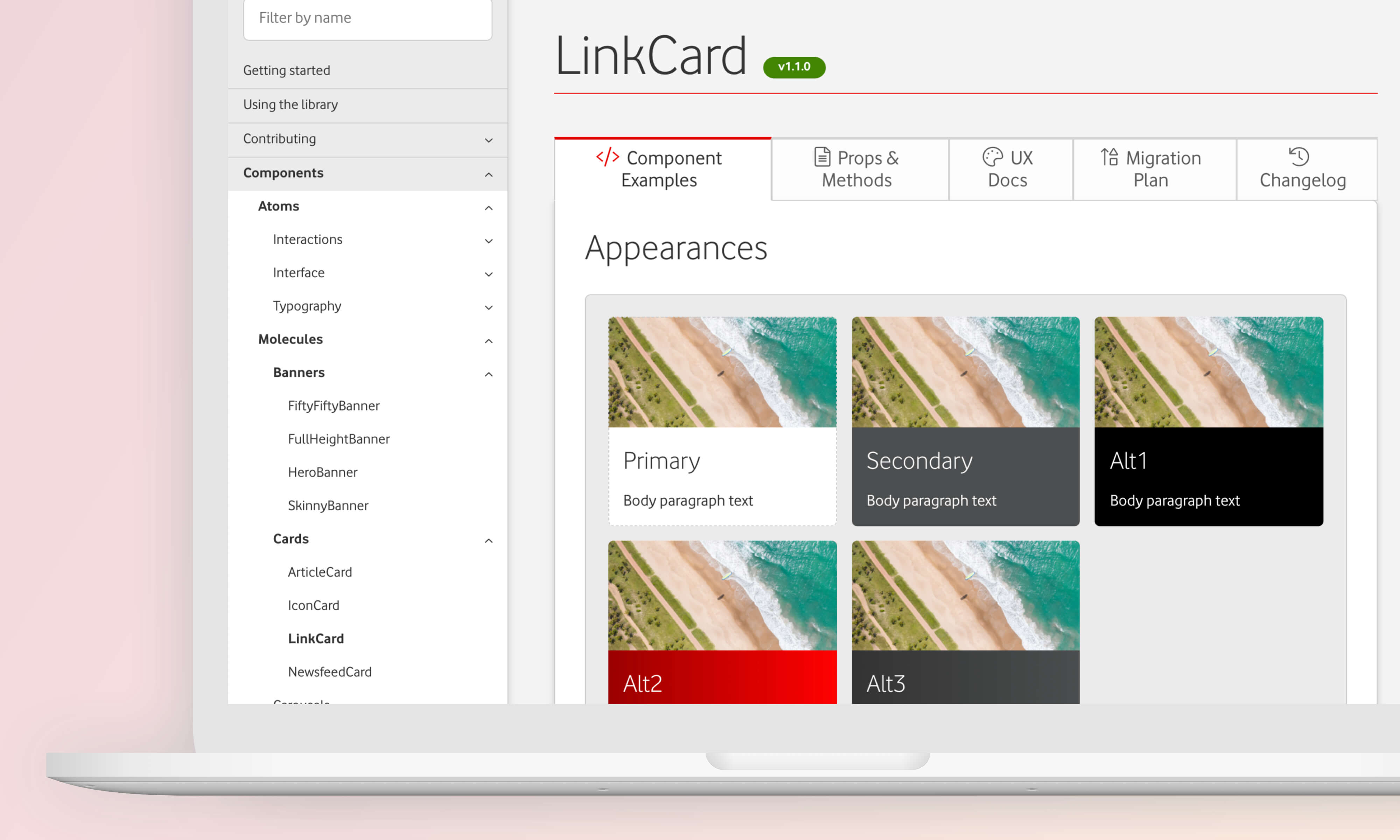
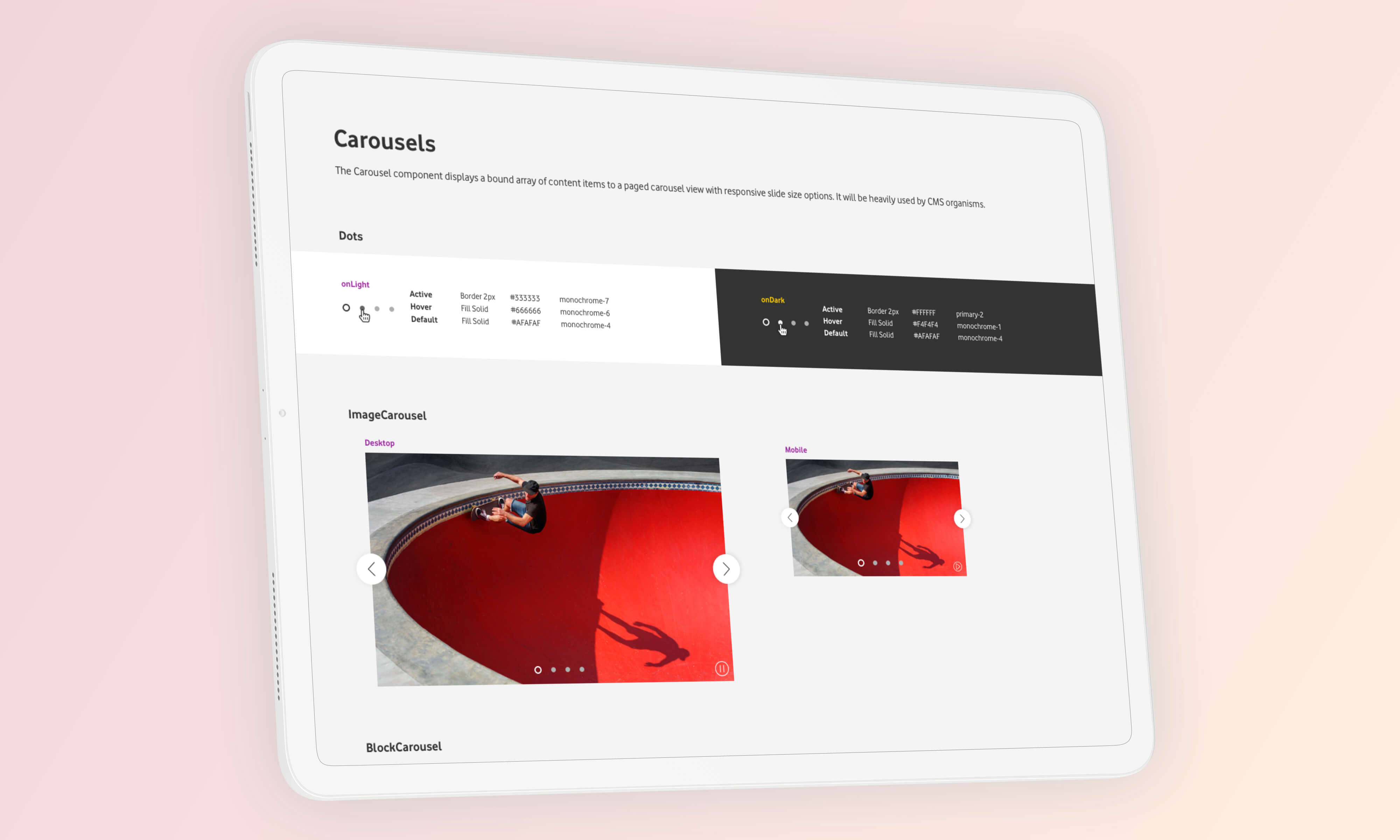
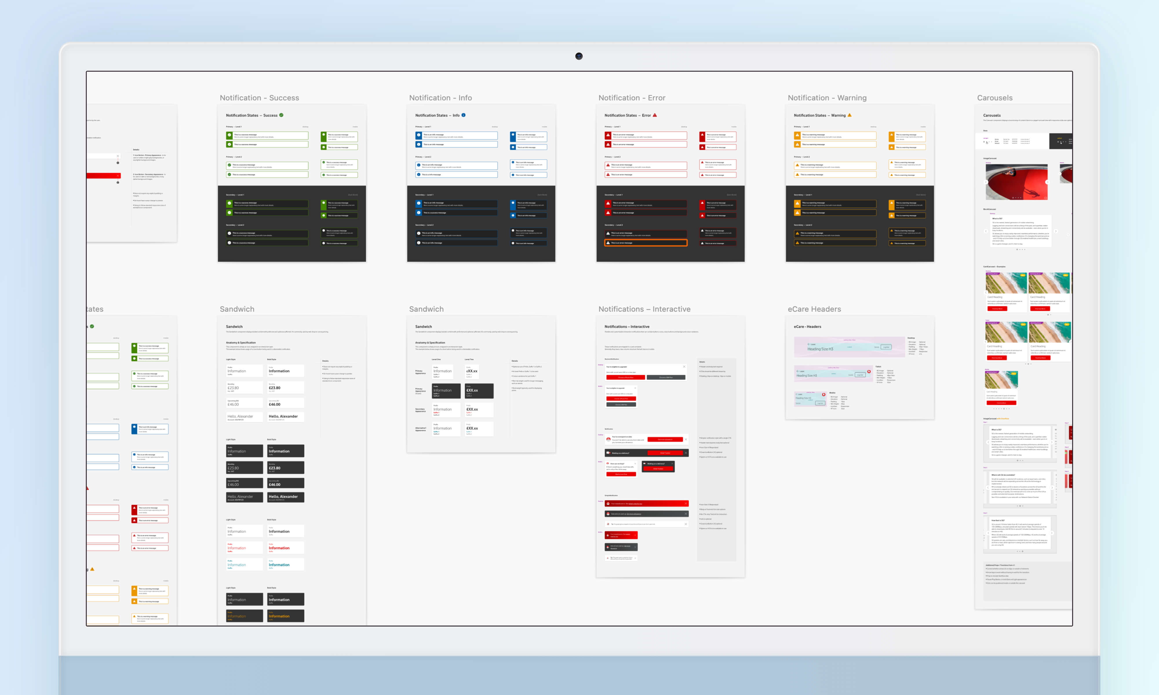
The DocSite truly became the heart and soul of the entire project, as it become the 'source of truth' for all components, styles and design guidelines. The site was built using StyleGuidist, as that offered greater flexibility than StoryBook and handled our React library better. It also gave us the option to create a UX Documentation tab for each component, where we could write more specific UX and Design guidance and display Sketch symbol demos.
Being able to share the URL of specific components was immeasurably useful, as it made the process very quick in getting everyone on the same page, literally. It also allowed us to post updated and release notes when components were updated, allowed end users to submit bug reports and users could toggle different themes (Vodafone, Voxi, VF Business etc) and see how the styling of each component changed within each theme.
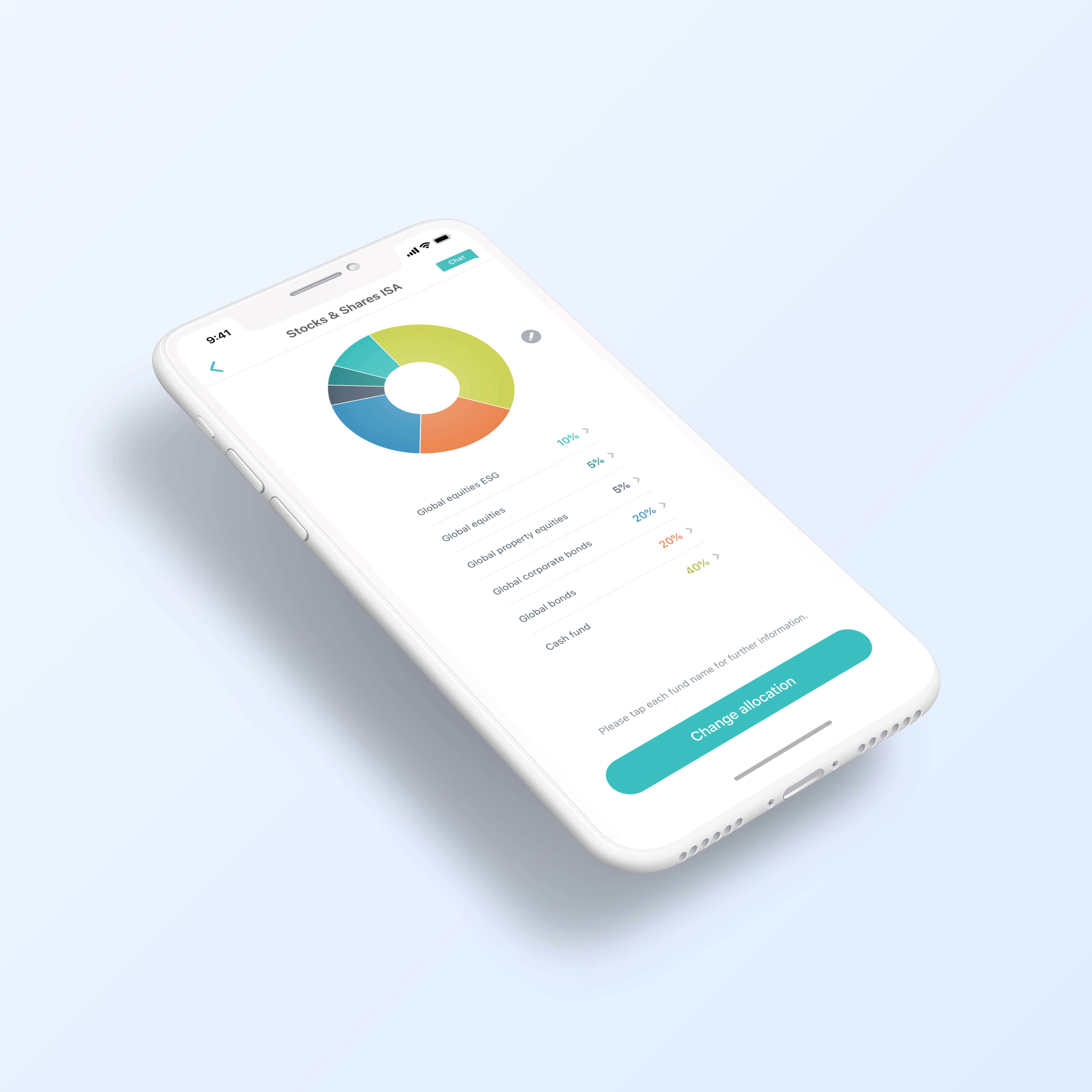
Themeable components were another key cornerstone of the v2 library, and so design tokens were an important element to define from the outset. Design tokens allowed us to specify levels of appearance, state and style in a consistent manner and to then pass these values across different themes, without locking down the components to the extent that they were unusable.
Sketch Components
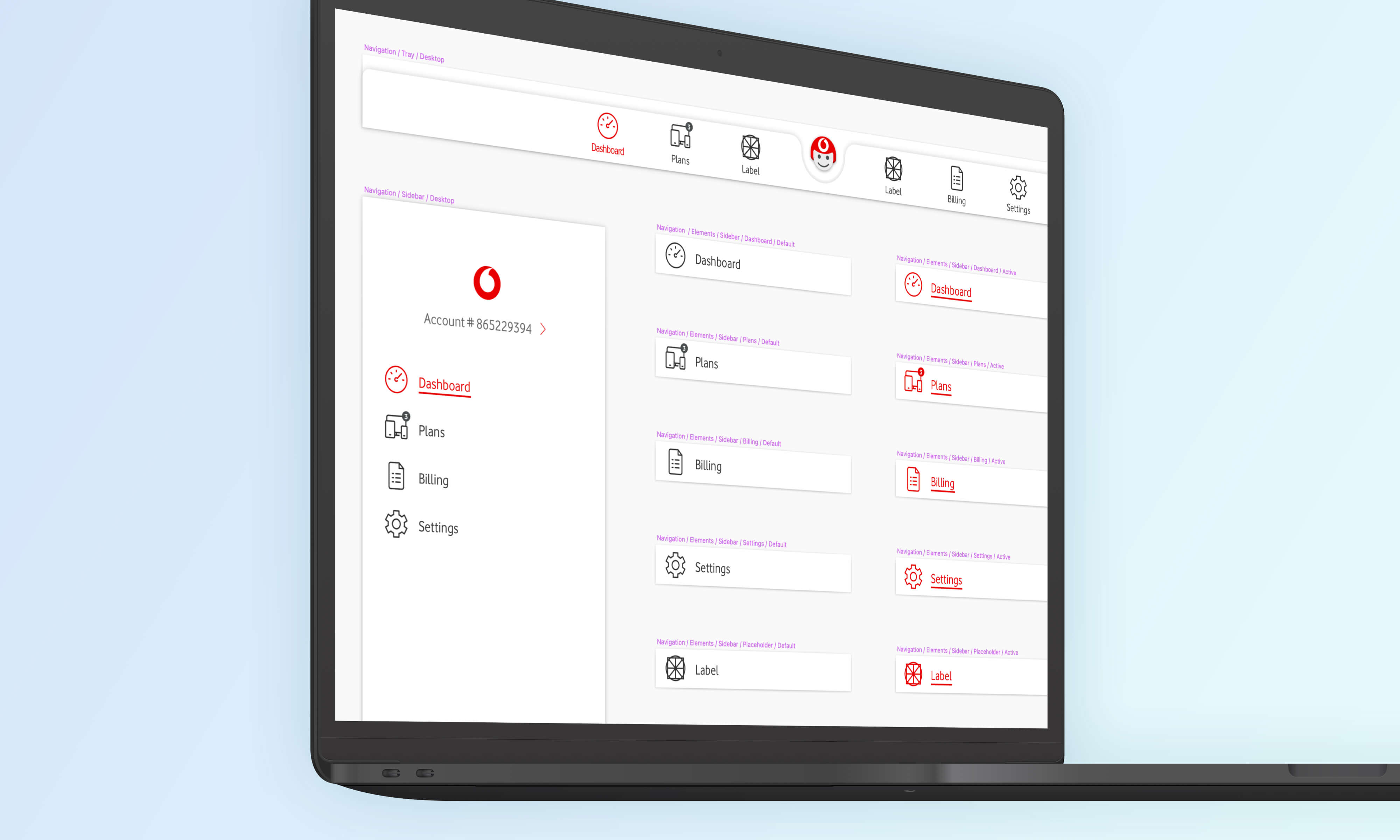
Our plan was to create a single Master Sketch Library, which we would then distribute to the rest of the organisation via InVision's DSM platform. We knew that it was important also to not change the structure of the existing Design System too much from the current style, to avoid unnecessary confusion.
We endeavoured to make the Sketch Symbols as flexible as possible, to negate the need for Designers to have to break symbols in order to use them properly. A Slack channel was setup that would automatically send an update when a new version of the Sketch Library was published, along with some release notes, but also allowed Designers to comment directly (with greater visibility) if any bugs or issues with symbols were encountered.
It was important also to note where some components were required for Dev reasons, but had no need to exist in the Design System. For example, the interactionWrapper component was required every time a component was to be clickable or contained some form of user interaction - largely for analytics and accessibility reasons - but there was no real UI specification. This solidified our approach in having both Design and Development sources of truth - but ensuring that the information was consistent across both collections.
Appearance Levels
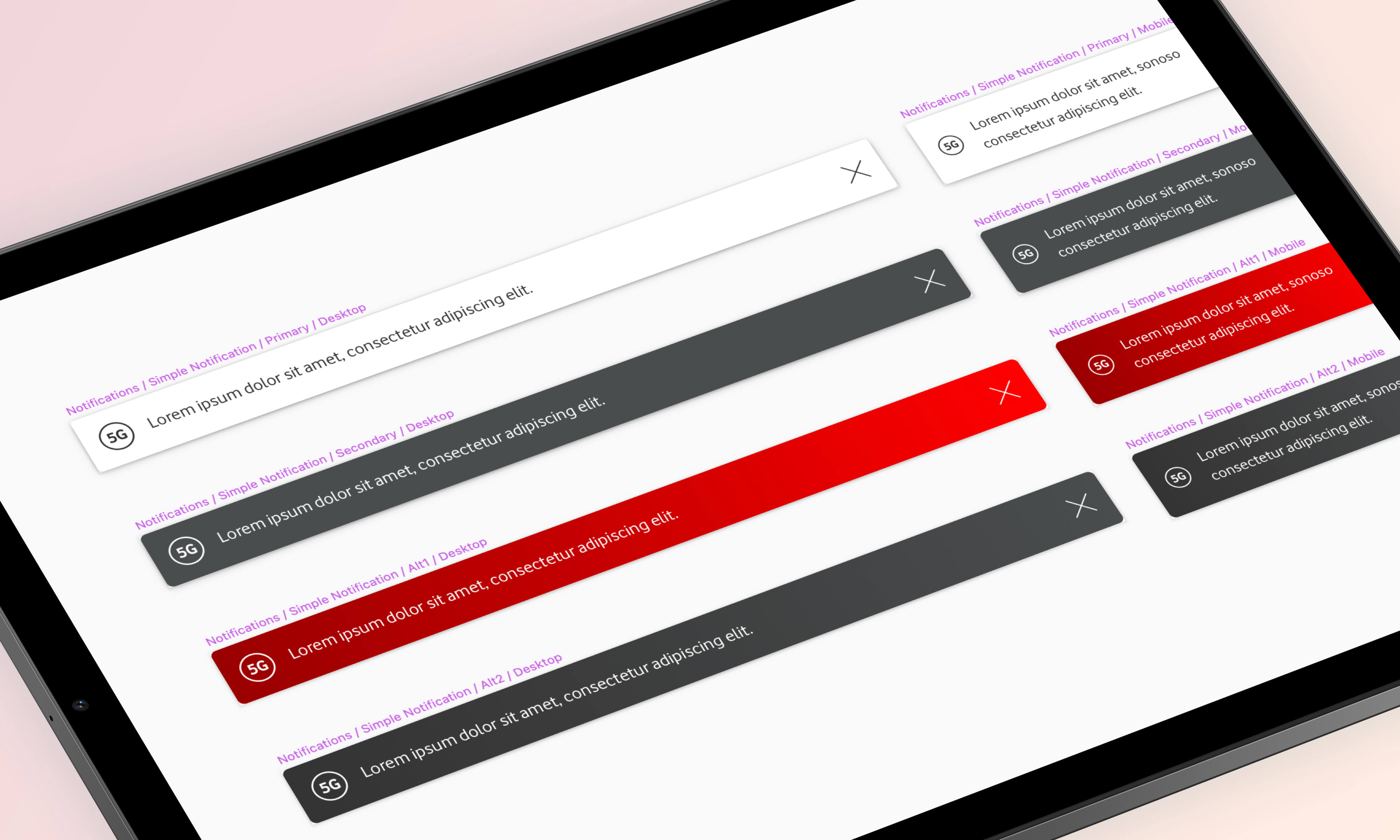
An unintentional development of the Design System & Component Library was the notion of Appearance Levels. Initially, we had a handful of components that would need to work in more than one visual style (often just dark and light versions) but as the library progressed we found that we achieved more consistency in having pre-defined appearance levels that could just be applied to every component.
The appearance token then became another key attribute when specifying components, and saved us time as we did not need to spec up each component in it's different states, we could simply define the appearances on a global level and then specify which components were going to adhere to having multiple appearances, and which would not.
DSM
Whilst the StyleGuidist DocSite provided the most comprehensive resource of components and library information for developers, we had the opportunity to utilise InVision's (then newly released) DSM tool to house the Design System and Sketch Library.
DSM allowed us to upload all of the Sketch Symbols from the Library, to then group them in their relevant atomic structure folders, and to also include UX Documentation, UI Notes, and to embed the relevant StyleGuidist page for Dev reference.
The most beneficial feature however was that we could upload the file as a shared Sketch library, and users could then subscribe to the library and receive updated as and when a new version was published. This "one-way" flow was really helpful in controlling the changes of any components, and stopping confusion and miss-communication between Designers across the organisation.